What font does Netflix use?
Netflix’s website sets every line of text in Netflix Sans, the company’s own typeface. The sizes, weights and font files, measured with FontMeter, plus free fonts with a similar look.
The short answer
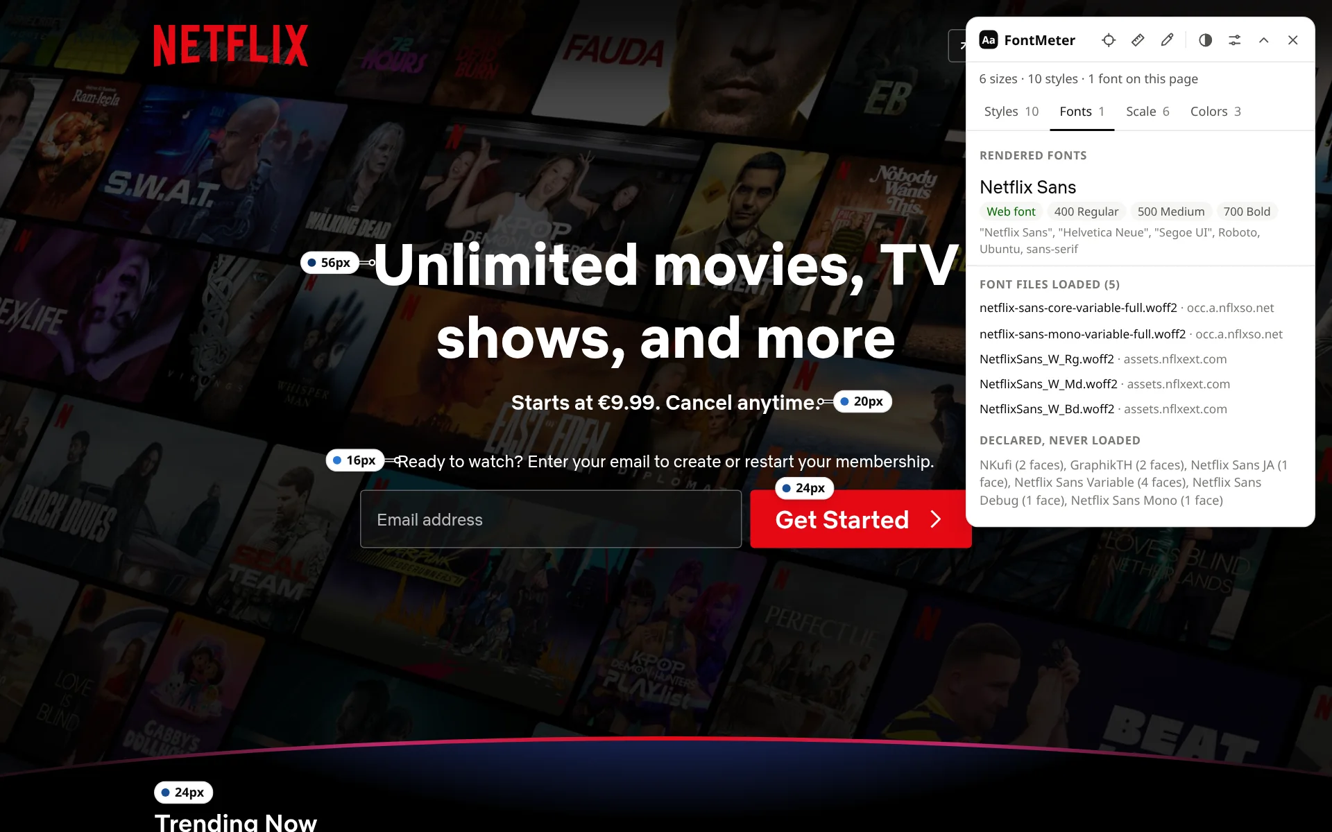
Netflix’s website uses Netflix Sans, Netflix’s own typeface, for all of its text. On the signed-out home page FontMeter found it in three weights, Regular (400), Medium (500) and Bold (700), from the 56px bold headline down to 13px small print. Netflix introduced Netflix Sans in 2018; it was made with the type foundry Dalton Maag.
Fonts on netflix.com
| Font | Source | Weights in the CSS | Share of the text |
|---|---|---|---|
| Netflix Sans | Web font (downloaded) | 400 Regular, 500 Medium, 700 Bold | 100% |
Netflix Sans. Five font files download from Netflix’s own servers: Regular, Medium and Bold files of Netflix Sans and two variable font files. If Netflix Sans can’t load, the CSS falls back to Helvetica Neue (macOS), Segoe UI (Windows), Roboto (Android) and Ubuntu, then any sans-serif. The CSS also declares fonts this page doesn’t need, such as NKufi, GraphikTH and Netflix Sans JA, by their names for Arabic, Thai and Japanese.
Text styles
| Text | Size / line height | Weight | Font |
|---|---|---|---|
| Main headline (“Unlimited movies, TV shows, and more”) | 56px / 70px | 700 Bold | Netflix Sans |
| Row titles (“Trending Now”) | 24px / normal | 500 Medium | Netflix Sans |
| FAQ questions | 24px / normal | 400 Regular | Netflix Sans |
| “Get Started” button | 24px / 24px | 500 Medium | Netflix Sans |
| Price line under the headline | 20px / normal | 500 Medium | Netflix Sans |
| Sign-up prompt above the email field | 16px / 24px | 400 Regular | Netflix Sans |
| Footer links | 14px / 21px | 400 Regular | Netflix Sans |
| Small print | 13px / 19.5px | 400 Regular | Netflix Sans |
Type scale
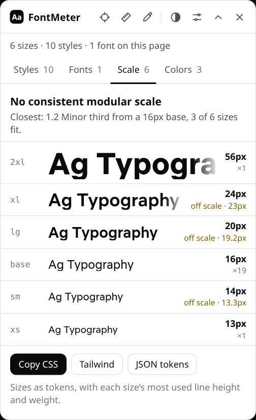
Six sizes: 56, 24, 20, 16, 14 and 13px. They don’t follow one modular scale: the closest ratio, 1.2 (minor third) from a 16px base, fits only three of them.
The NETFLIX logo
The red logo at the top of the page is an image, not text, so no font draws it. For a similar tall, condensed look in your own designs, try Bebas Neue or Anton, both free on Google Fonts.
Can you use Netflix Sans?
Netflix Sans was made for Netflix and isn’t on Google Fonts or Adobe Fonts. For a free font in the same spirit, start with the stand-ins Netflix’s own CSS names: Segoe UI and Helvetica Neue come with Windows and macOS, and Roboto is free on Google Fonts. Inter is another close, free choice.
Check it yourself
- Add FontMeter to Chrome (it’s free).
- Open netflix.com and press Alt+Shift+F.
- Open the Fonts tab for the fonts that render, or hover any label for that text’s font and size.
Other ways to find a website’s font, with nothing to install: how to find out what font a website is using.
How this was measured
FontMeter 2.0.0 in Chromium 156 on Linux, signed out, from the Netherlands, on 5 November 2026. Page: https://www.netflix.com/. Sites change their fonts, test new designs and show different pages by country and account, so what you see may differ. Fonts that come from your computer (rather than the website) depend on your operating system.
See every font on a page in one click.
FontMeter is free. Add it to Chrome, open any page and press Alt+Shift+F. On Microsoft Edge? Get it from Edge Add-ons.
Fonts on other websites
- whatsapp.com
What font does WhatsApp use?
WhatsApp Sans
- youtube.com
What font does YouTube use?
Roboto
- amazon.com
What font does Amazon use?
Arial and Amazon Ember
- duolingo.com
What font does Duolingo use?
Duolingo Sans and Feather
- airbnb.com
What font does Airbnb use?
Airbnb Cereal
- notion.com
What font does Notion use?
NotionInter, Lyon Text
- ikea.com
What font does IKEA use?
Noto IKEA
- wikipedia.org
What font does Wikipedia use?
Default sans-serif, Linux Libertine / Georgia
- vogue.com
What font does Vogue use?
Vogue Avant Garde